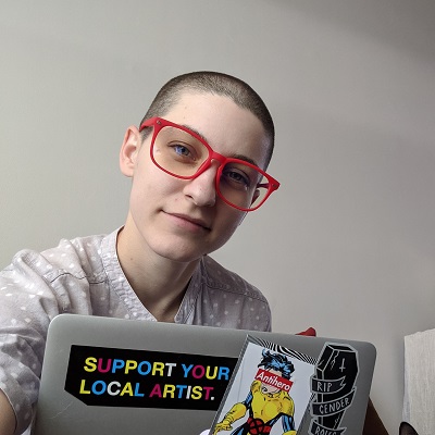
Tori Hart smiles at the camera behind their laptop, which is covered in quirky stickers.

Tori Hart

I design and develop online experiences with the aim to bring the human experience back into the UX conversation and create useful, creative, simpler solutions that benefit all users.

Leadership

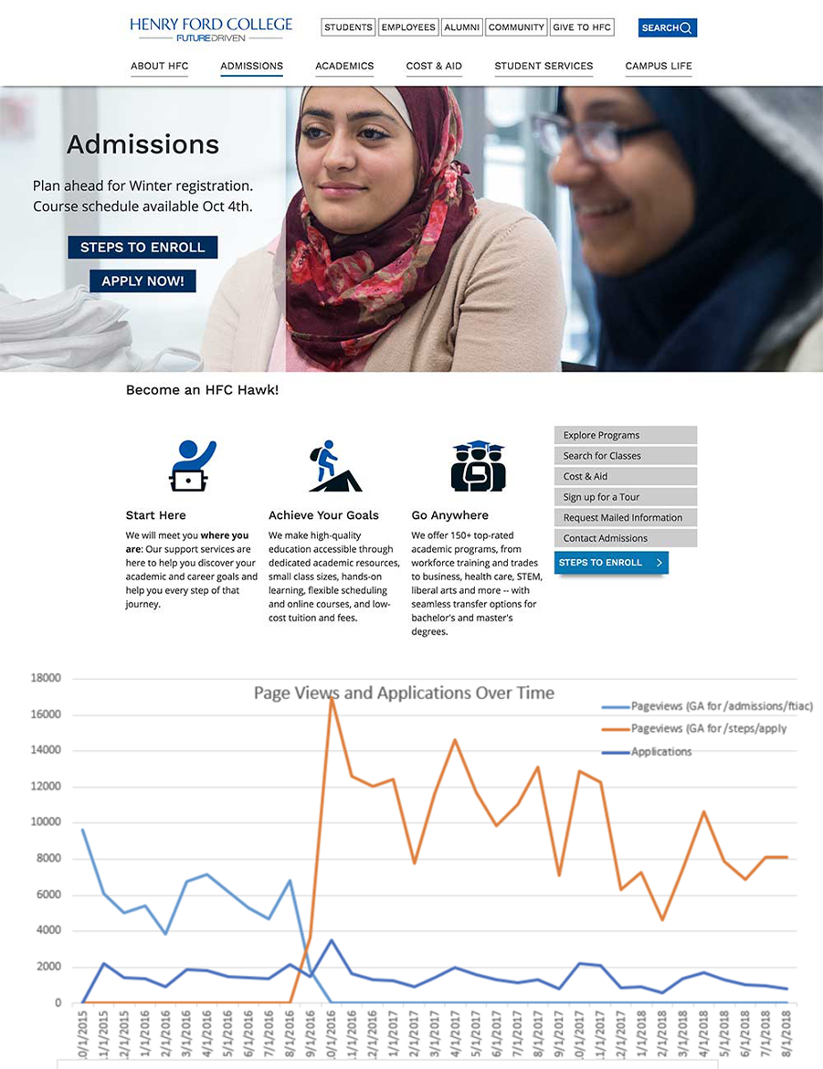
Combined image: top is a screenshot of a prototype of the newly designed Admissions page for Henry Ford College. Page shows a large hero banner with clear calls to action for enrollment steps and to apply. Below this is a line graph spanning from 2015 to 2018 showing that on the launch date in August 2016 there was a sharp upward trend in traffic to the apply page.
New HFC admissions page and launch traffic

At Henry Ford College, I lead the overhaul of the entire website: design, navigation and content. The project involved many stakeholders that spanned all areas of the college. I created and strengthened direct relationships with all of these stakeholders by listening carefully to their goals and concerns, providing training and support, and following-up with regular communication.

Stakeholder participation was essential in making the launch and adoption successful. Shown in the screenshot, you can see that the site changes immediately lead to more traffic on the new college application page.

  • Section 508
  • Lead Stakeholder Presentations
  • UX + User Testing
  • Google Analytics
Combined image: top is a screenshot of a prototype of the newly designed Admissions page for Henry Ford College. Page shows a large hero banner with clear calls to action for enrollment steps and to apply. Below this is a line graph spanning from 2015 to 2018 showing that on the launch date in August 2016 there was a sharp upward trend in traffic to the apply page.
New HFC admissions page and launch traffic

Universal Design

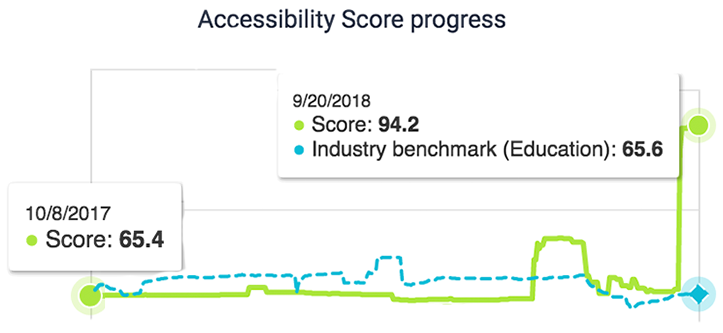
Screenshot of Accessiblity metrics dashboard showing the accessibility score increasing from 65.4% in October 2017 to 94.2 in September 2018.
HFC's Accessibility progress measured in the SiteImprove dashboard

Early in my studies and career, I began advocating for usability and accessibility. In multiple job roles, I brought up these concerns and educated stakeholders until it became an adopted practice.

At Henry Ford College, my dedication to these standards was a huge asset when Section 508 compliance became a top priority task across the college. From the onset, I was the subject matter expert while they searched for a permanent candidate to fill the Accessiblity Coordinator role. During this time, I drafted policy for cabinet leadership approval, and improved the website accessiblity score to 94%.

  • Section 508
  • WCAG Accessiblity Standards
  • UX + User Testing
  • Google Analytics
Screenshot of Accessiblity metrics dashboard showing the accessibility score increasing from 65.4% in October 2017 to 94.2 in September 2018.
HFC's Accessibility progress measured in the SiteImprove dashboard

Dev + Documentation

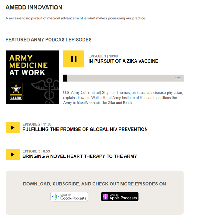
Screenshot of a section of the GoArmy website, an implementation of pixel perfect design. There is a custom podcast player featured.
Custom Podcast Player developed for Pixel Perfect Design

Throughout my career I have proven to be a dedicated team member; eager to reach out and create solutions with clear documentation for the whole team. I found creating documentation to be a natural extension of my onboarding process, and even as a new hire, I became a relied upon reference in multiple teams.

I have a variety of professional and personal development experience. I am quick to pick up new languages and libraries and adapt when joining a team or pursuing continuous improvements to the codebase.

  • JavaScript / jQuery
  • CSS3
  • HTML5
  • Drupal
  • APIs and Local Storage
  • Typescript
  • Node.js
  • React
  • Atomic Design
  • Pixel Perfect
  • Responsive Design
  • WCAG Accessiblity Standards
Screenshot of a section of the GoArmy website, an implementation of pixel perfect design. There is a custom podcast player featured.
Custom Podcast Player Developed to Match the Pixel Perfect Design

Art + Design

Freelance design work has been a hobby of mine from a young age. I have frequently created or contributed to designs while working in a Developer role. Being design savvy and familiar with much of the Adobe Creative Suite has allowed me to communicate seamlessly with UI/UX and designer team members, as well as fill that need when such a role was vacant.

The following are a few examples of freelance designs I created using Adobe Creative Suite.

  • Adobe Photoshop
  • Adobe inDesign
  • Adobe Illustrator
  • Adobe Acrobat Pro
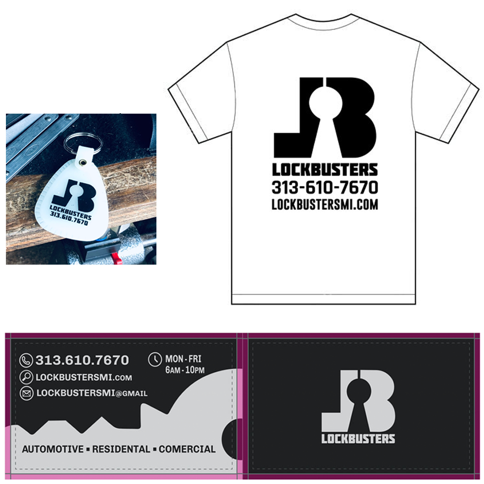
Lockbusters logo and branding set including logo design, T-shirt, keychain and business cards created by Tori Hart. The logo design is a bold backwards 'L' next to a 'B' with a keyhole in the center of where the letters meet.
Logo and Branding Materials
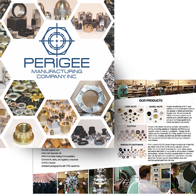
Perigee Manufacturing brochure design created by Tori Hart. Glossy high-quality brochure front cover features hexagonal collage of vibrant photos of specialty manufactured fasteners and nuts. Inner brochure page is shown with asymetrical design and more photos and details of Perigee Manufacturing.
High-Quality Photo Brochure
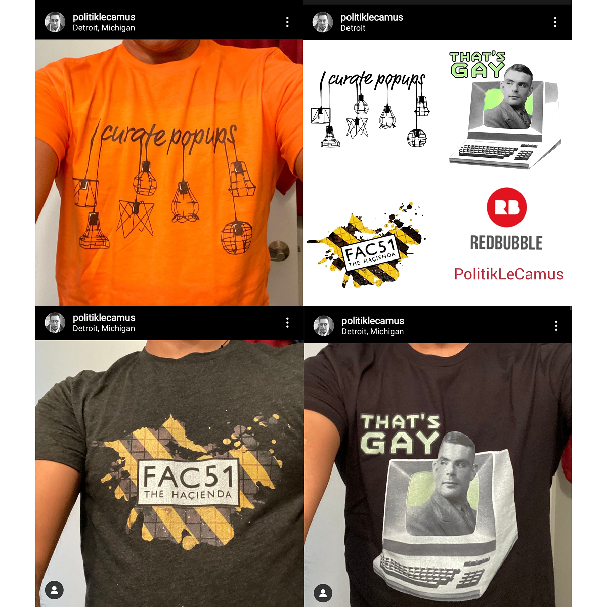
Collage image of Three t-shirt designs by Tori Hart and the resulting shirts that were printed. The first design is a black and white line-drawing of fancy pendant lamps appearing attached or hanging from a cursive phrase that reads 'I curate popups'. The second design is a yellow and black diagonally striped splatter that appears dirty and textured like a tile floor with a white square centered text that reads 'FAC51 The Hacienda'. The final design is an old computer terminal with attached keyboard, Alan Turing is peeking out of the computer screen and there is text near his head that reads 'That's Gay'
Pop Culture T-Shirt Designs
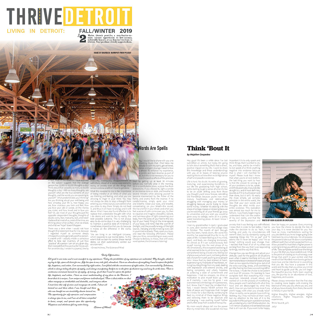
Thrive Detroit Magazine design greated by Tori Hart.
Simple Logo and Newspaper Design